
What a Showhouse Leaves Behind
At Brooklyn Heights’ 2026 designer showhouse, the useful ideas extend beyond individual objects: how rooms organize conversation, absorb history and make space for daily life.

A showhouse is a temporary arrangement with a long afterlife. The doors close, but the rooms remain in photographs, portfolios and the minds of people planning homes of their own. What survives best is not always the most dramatic purchase. It can be a way of arranging seats, resolving an awkward ceiling or making a small room feel deliberate rather than diminished.
The 2026 Brooklyn Heights Designer Showhouse occupied 1 Monroe Place from October 2 through November 1. Its public run has ended. Nineteen participating design firms worked within a landmarked nineteenth-century house to support the Brooklyn Heights Association. The rooms’ published design statements now provide a useful record of the problems the teams chose to solve and the ambitions behind their choices.
This is a reading of those documented proposals, rather than a firsthand tour review. It asks what a reader can take from the project after the visiting hours have expired. The answer is more substantial than a shopping list, particularly when the rooms are considered alongside the neighborhood organization the event benefits.
A house within a civic history
The Brooklyn Heights Association’s account of the property identifies 1 Monroe Place as an 1852 corner mansion, 25 feet wide, associated with the Weir family and its longstanding floral business. That specificity matters. A showhouse does not begin as a blank box; its proportions, windows and inherited alterations establish conditions every designer must address.
The larger setting carries its own history. The Landmarks Preservation Commission’s district map records the Brooklyn Heights Historic District’s designation on November 23, 1965. The historic district encompasses a neighborhood, not simply a collection of photogenic facades.
Preservation and contemporary design can appear to pull in opposite directions. In practice, an old house creates a more interesting assignment than either imitation or wholesale erasure. Which proportions remain useful? Which changes were themselves later interventions? How can a room acknowledge age while serving a household that lives differently from the original occupants?
Those questions are more durable than any one color scheme. They also make the showhouse relevant to readers who will never commission a room on this scale. Most homes contain inherited conditions. Design begins by deciding which to work with and which to change.
The beneficiary beyond the doorway
The Brooklyn Heights Association was founded in 1910. Its stated work combines preservation with contemporary neighborhood concerns, including traffic safety, schools, public space and development. The showhouse is a fundraiser for that organization, connecting an interest in interiors to the continuing care of the surrounding streets.
The Center for Brooklyn History’s archival finding aid provides another perspective. Its BHA collection contains newsletters, correspondence, annual reports and other records, with much of the material dating to the 1960s and 1970s. That is the less glamorous infrastructure behind an attractive neighborhood: meetings, documentation, advocacy and sustained local participation.
A benefit’s cause should not disappear behind its decor. The relationship here is unusually coherent. A historic house becomes a temporary platform for contemporary design, and the proceeds support an association concerned with the place in which that house stands. It does not follow that every decorating decision is an act of preservation, but the event creates a direct connection between private interiors and public surroundings.
The lasting question is whether a visitor’s attention travels outside afterward. The street, the trees, the scale of nearby buildings and the way people move through the neighborhood are also designed conditions, often maintained through less visible work.
Llewellyn Chupin: arranging a conversation
Llewellyn Chupin’s Drawing Room takes the room’s modest size as the starting point for a continuous low banquette around its perimeter. The designer’s statement describes an arrangement in which people face one another rather than a single dominant focal point. Mirrors, curtains and silk upholstery provide contrasting reflective and soft surfaces.
The transferable idea is spatial before it is decorative. A conventional collection of separate chairs and sofas can divide a small room into competing pieces. A continuous seat can make the boundary do useful work and leave the center more legible. Whether that is appropriate in another home depends on circulation, comfort and the way its occupants gather.
It is also a reminder that furniture silently directs social behavior. A room organized around a screen asks for one kind of attention; a room organized around other people asks for another. Neither arrangement is universally correct. The useful design decision is to know which activity the room should make easy.
Momeni appears among the project’s credited vendors, alongside textile, paint, hardware and other collaborators. Those credits explain that the apparent unity of a room is produced by many contributions. A finished image can conceal that distributed work.
Rachael Rosenblum: the entry as a story
Rachael Rosenblum’s The Unseen approaches the entrance through symbolism, pattern and the suggestion of accumulated history. Her published account identifies tarot as an inspiration and describes Schumacher’s Giove fabric continuing across walls and ceiling. Custom upholstery, tiled surfaces and eye motifs contribute to the scheme.
Rosenblum’s background in textiles helps explain the emphasis on material relationships. The room statement treats existing and collected objects as carriers of memory rather than obstacles to a coherent interior. That is a valuable counterpoint to the idea that a successful renovation requires everything to arrive new and perfectly matched.
For a reader, the lesson is not to reproduce the motifs. It is to understand how repetition can establish continuity while changes of texture keep the result from becoming flat. A pattern used across more than one plane can alter the apparent boundaries of a room; an unexpected object can interrupt that continuity at a chosen point.
An entrance is a particularly revealing place to test those choices. It must welcome movement, absorb the transition from outside and establish a tone without requiring a visitor to stop and study every detail. The design ambition lies in making those roles coexist.
Sugarhouse: turning a problem into architecture
Sugarhouse Design & Architecture’s dining room and kitchen began with an awkward ceiling condition created by earlier mechanical work. The team’s account describes using faux beams and botanical stenciling to bring different ceiling heights into a deliberate composition. In the kitchen, cabinetry was reconsidered to make room for seating at the island.
Those are useful examples because they concern constraints, not simply finishes. A ceiling that cannot economically become flat may still become intentional. Storage that occupies every available inch may reduce a kitchen’s usefulness if it leaves nowhere for another person to sit.
The dining room’s documented scheme combines a panoramic wallcovering, glossy wainscoting and layered lighting. Its stated ambition includes both evening atmosphere and the possibility of children doing homework at the table. A room can have more than one register without losing its identity.
The broader principle is to evaluate a design across a day. A photograph often captures one ideal lighting condition and one arrangement of objects. A household needs morning light, practical tasks, conversation and the less composed moments between them. The most interesting room concepts make room for that variation instead of treating it as a threat to the image.
Studio Olivine: looking outward
Hannah Blumenthal’s Studio Olivine guest bedroom takes its cue from a corner room’s treetop outlook. The published description connects a blue-ground floral silhouette wallpaper with the sky and branches beyond the windows, balancing it with pale window treatments and natural wood. British antiques and contemporary pieces are part of the mix.
The proposal offers a quieter kind of continuity than literal indoor-outdoor matching. A room can acknowledge its outlook through color, rhythm and material without pretending to be a garden. The view becomes one element in the composition rather than a decorative image to compete with.
Blumenthal’s art-history training and museum experience are included in her official project biography. The useful connection is an attention to objects and how they relate, not an assumption that academic credentials guarantee a successful bedroom. A guest room has immediate obligations: somewhere to sleep, set down possessions and inhabit the space without needing instructions.
For readers applying the idea elsewhere, begin with what the window already provides. A distant building, a tree canopy or a patch of sky can suggest a palette or a calmer distribution of visual emphasis. Buying more objects is not always the first move.
Innerform: one house, different registers
Innerform’s rooms use botanical references in contrasting ways. The parlor-level powder room and minibar employ deep greens, stone and a mural; the primary bathroom takes a lighter approach with abstract botanical wallpaper, blush tones and a pink-and-white checkerboard floor. The studio is co-founded by Elle Liu and Alex Gong.
What connects these spaces is not identical decoration but a recurring subject translated for different functions. That is a useful alternative to making every room match. Continuity can arise from a family of ideas, materials or proportions, while individual spaces retain their own degree of intensity.
Small service rooms often invite bolder choices because they are experienced briefly. A bathroom used every morning has a different relationship to light, storage and routine. A convincing whole-house scheme recognizes those differences instead of distributing a single visual formula everywhere.
The room descriptions also show why photographs alone are incomplete specifications. A stone’s appearance does not establish its maintenance requirements, and a beautiful fixture does not explain installation conditions. Inspiration and a construction decision are separate stages. Take the spatial idea from the image, then investigate the practical system before reproducing it.
Adroit: changing the room’s assignment
Adroit Architecture & Interior Design’s Flora and Fauna began with a compact guest bedroom and recast it as a space for yoga and meditation. Its documented elements include a daybed with storage, concealed screen functionality and a preserved-moss ceiling developed with a horticultural collaborator. The design statement calls the adjoining sauna-like installation a “faux sauna.”
That last distinction is important: a showhouse concept is not proof of operating equipment or a health benefit. What is useful here is the decision to reconsider the room’s purpose before selecting its furnishings. An infrequently used bedroom may or may not be the best use of a limited footprint.
The same question applies in ordinary homes. Which activities actually need dedicated space? Which can share a room? Where do the objects required for an activity go when it ends? Storage is part of the experience, not an afterthought concealed beyond the photograph.
A richly treated room can suggest restoration without supplying a medical claim. Its success for a particular household would depend on whether it supports an actual routine. That is a better test than whether it resembles an aspirational wellness image.
The publicity is part of the picture
In The PR Net’s essay on showhouse participation, Allison Hay PR describes how designers and brands extend a room’s life through photography, events, editorial coverage and professional relationships. It is a useful primary account of the promotional work surrounding these projects, including Momeni’s participation in Brooklyn.
For readers, that context improves rather than diminishes the experience. A showhouse can simultaneously support a neighborhood organization, give designers room to experiment and provide brands with visibility. Understanding those functions helps distinguish a compelling design argument from a product’s repeated appearance.
Credits deserve attention for the same reason. They tell us who designed, fabricated, supplied and photographed the work. A room is not made by the headline name alone. Thoughtful coverage should make those contributions legible without becoming a catalog of everything available for purchase.
After the doors close
The 2026 showhouse is now an archive, not a current visiting recommendation. Its published rooms nevertheless support a continuing conversation about how homes work. Seating can redistribute attention. A ceiling can absorb a constraint. A window can establish a palette. An inherited object can become the beginning of a room rather than the item to remove.
The strongest takeaway is a method of looking: identify the problem before admiring the solution. Ask what the designer inherited, what changed and which daily activity became easier or more interesting. That approach makes a showhouse useful at any budget. The temporary installation ends; the better questions remain.
Keep reading

Art & Culture · Museum Careers
The American Alliance of Museums: A Membership for the People Behind the Galleries
AAM connects museum professionals with learning, research, publications and peers. A practical look at its membership benefits, categories and official joining route.
Save the dates
What a Showhouse Leaves Behind
Time unconfirmed: saved as an all-day event. Calendar save only; book admission separately.

Art & Culture · Editorial
Miami Art Week After Dark: The People and Places Behind the Welcome
How fairs, music, restaurants and hospitality teams create Miami Art Week’s wider cultural experience, with useful planning links for a well-paced visit.
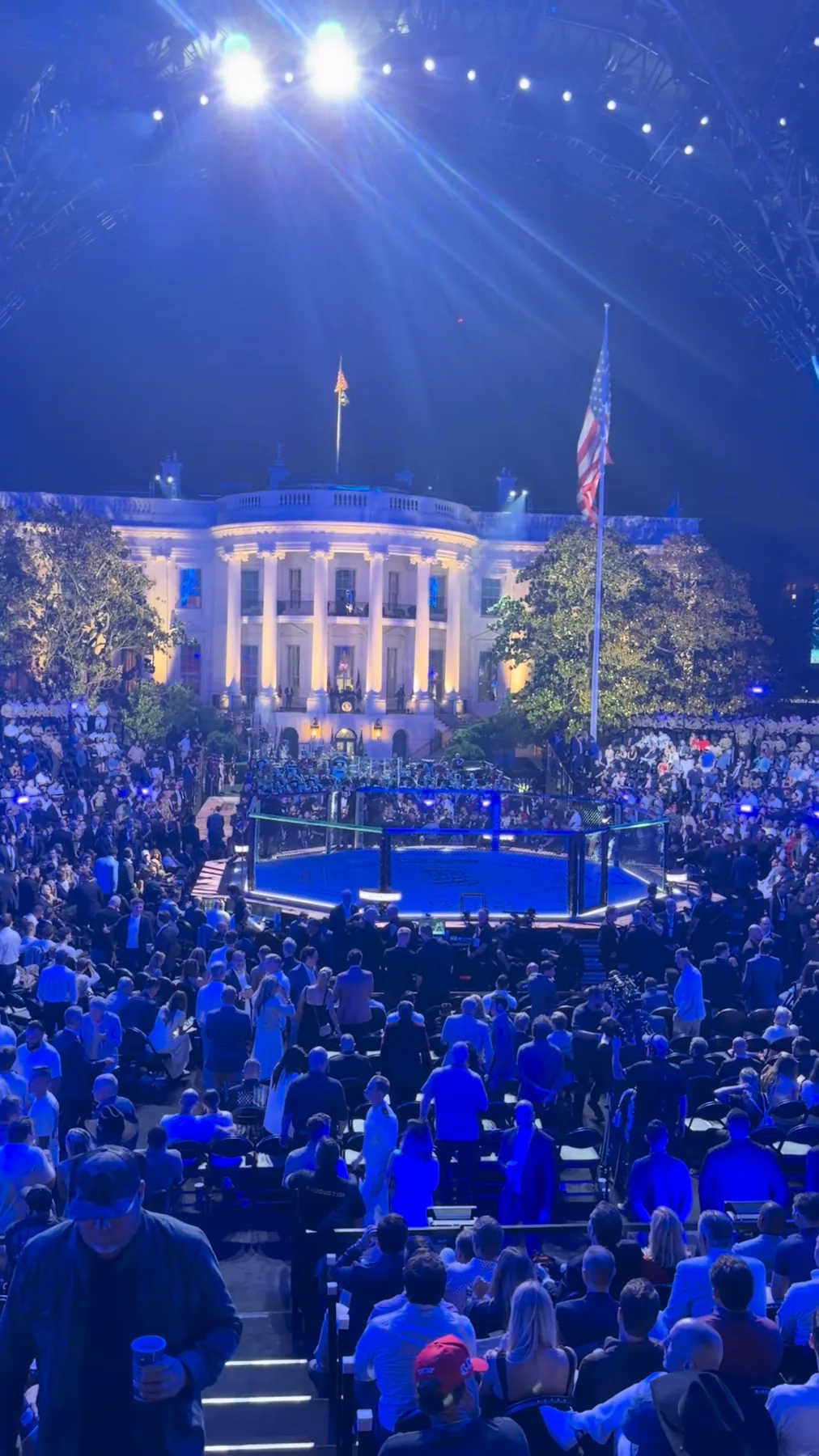
Sport & Society · Washington, D.C.
Ringside at the White House: My First UFC Night
David Shusterman reports from UFC Freedom 250 on the White House South Lawn: a fourth-row view, a remarkable crowd and a final moment inside the Octagon.